Better usability for a specialty coffee guide (5x success rate, 3x speed, and 2x satisfaction)
Summary: Independent research and usability study for a specialty coffee guide — I've identified three blocking issues and validated improvements, achieving 5x better task completion, 3x faster speed, and 2x higher satisfaction.
Context & problem
There's 1 in 100 chance to bump into a specialty cafe by chance. Mainstream platforms (Google, Yelp, etc), label “specialty coffee” loosely (eg including shawarma places), so they are not reliable for conaisseurs. That's why curated specialty coffee guides are valuable — but they suffer from poor usability and unclear business logic.

Role
Independent research & testing initiative to demonstrate improvements for Best Coffee Guide, a specialty coffee guide. I've identified where usability failures were masking value and blocking core user tasks, causing unnecessary friction, lost trust, and lost opportunities for upgrade.

Research & Synthesis
I've done User research, defining personas and key user stories, so I could formulate a Product Vision for users expectations.
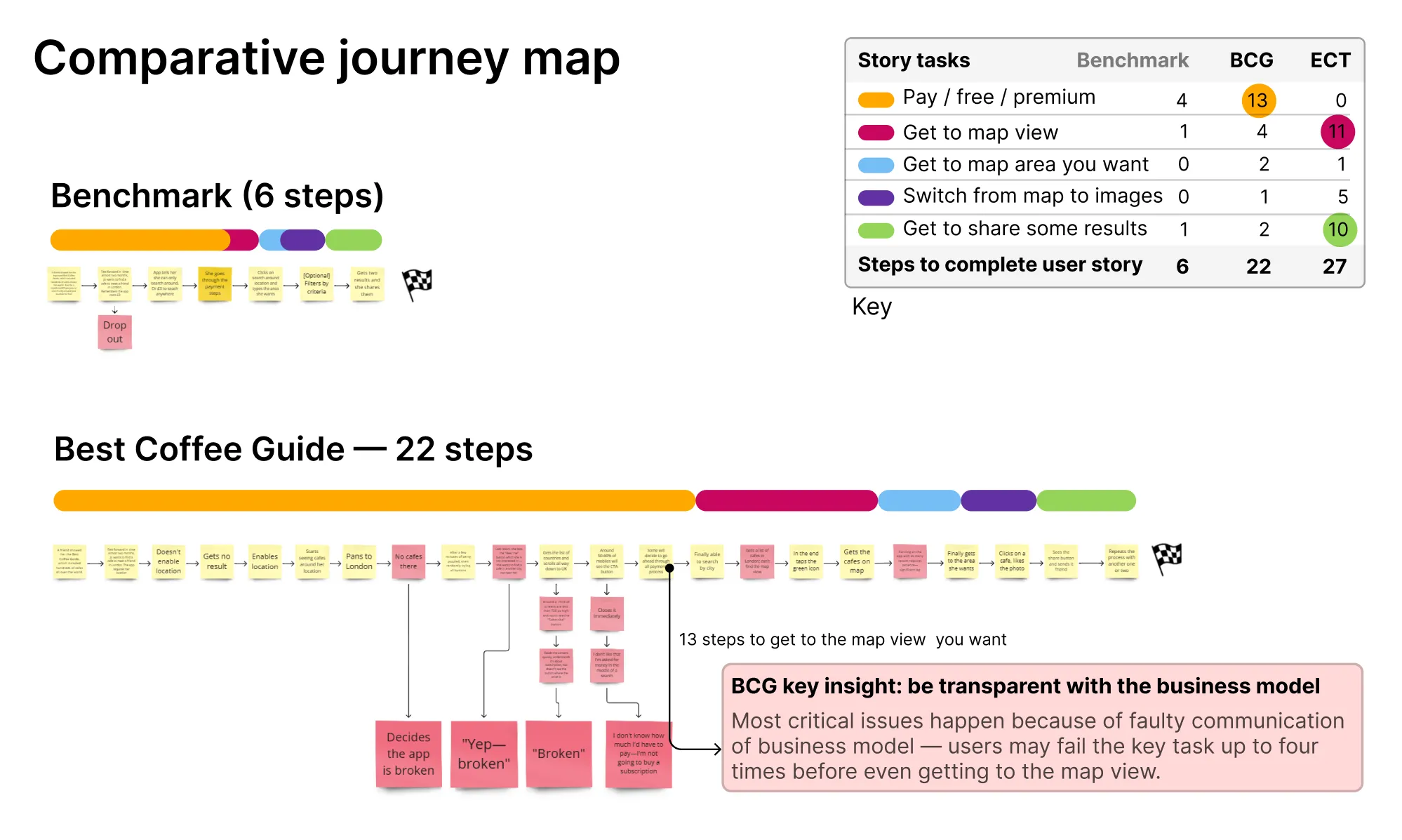
I've compared the journey map across the Product Vision (current app vs ideal), highlighting top pain points.
I've formulated the top 3 issues & fixes needed to achieve Product Vision completely.

Building prototype benchmark around key issues
Issue 1: Lengthy onboarding obscures the business model
Users are not clearly informed that the app downgrades after the free month. After the downgrade, missing results are interpreted as bugs. In testing, only one in five users could identify how to upgrade; on smaller screens, the upgrade CTA was not visible at all.
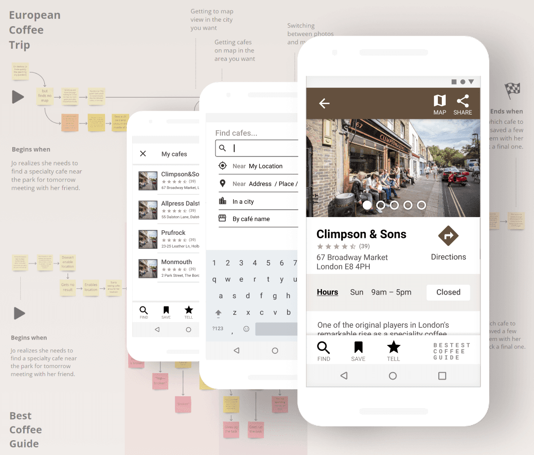
Issue 2: Difficult access to map view
The primary use case is location-based discovery, yet the app prioritized list views and inconsistent navigation. Comparative journey mapping showed that reaching the desired map view required 22 steps, with multiple failure points where users abandoned the task.
Issue 3: Hard to share with friends
Sharing and directions are part of the core user story. Visibility issues and weak affordances caused users to fail at sharing locations or getting directions, forcing manual workarounds.
Testing
I ran comparative moderated usability tests with representative users. I measured task completion, time on task and satisfaction (SUS).
Findings
Task completion: 5 times better.
Time on task: cut almost 4 times.
Satisfaction almost doubled.
Statistical significance
Testing with 5 users of same persona is statistically significant when big differences in task completion occur (5x). In simple language, it's less than 5% likely the results occured by chance — we're 95% confident on it.
Recommendations
A short list of recommendations for development, based on benchmark results and focusing on changes with highest impact and lowest implementation cost.


Best Coffee Guide vs improvement benchmark

Conclusion
Curated guides fill a real gap that apps like Google Maps never will. The problem is when usability failures make users question whether the product even works. Getting that out of the way is enough — the curation does the rest.
Learning points
"You are not the user" — it's fascinating what users can uncover during testing.
Specialty enthusiasts drink bad coffee more often than I would have thought.
Disconnects in usability testing are real — there's a gap between what users say and do.
The full story
Read the Medium article to explore the full journey with me (17 min).