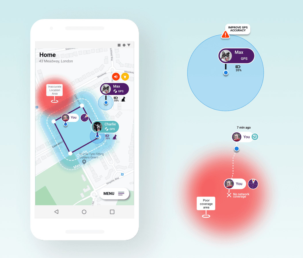
Translating technology complexity into better UX
Summary: How a user-centred design approach helps transforming technology complexities into better user experiences. Most pet geo-fencing app designs assume ideal conditions. But real users spend most of their time indoors, in courtyards, parks, or wooded areas — where accuracy degrades. When this happens, interfaces continue to behave as if data were precise, creating false alarms, anxiety, and loss of trust. Major pain points are caused by the mistranslations of technology behaviour. Mapping technology constraints to user mental models makes the system transparent and honest about its own limitations.

Goals
To design (for a pet-finding app) a system communicating transparently its own limitations, so users can trust it even when it's wrong.
To learn the “[...] ability to take an empathetic view of the user, and to interpret that into a systematic design solution.” — Peter Merholz
Role
Independent case study, initiated within a UX Research bootcamp. Challenge designed by UX researcher, as it requires solving technical constraints within real contexts. Sole designer, mentored by tutor.
Research & Synthesis
Research summary
User interviews
Interviews with dog owners to find out how people think and act during stressful events (e.g. losing a pet); what they expect the system to do when something goes wrong. Key users groups. Personas. Empathy and journey mapping.
Understand the conceptual model of technology
Learning how GPS signal quality works depending on context (indoors, trees, buildings, sky visibility) and how it causes mismatch between users' mental models and reality.
Desk research; competitive analysis of pain points (various apps)
Inventory of pain points as experienced by users of existing products.
Research synthesis
Most situations fall under three contexts (see below matrix):
Pet indoors / courtyard (poor GPS) -> most often triggering false alarms.
Pet outdoors with obstructed sky view -> usually triggering false alarms.
Real escape events requiring action, often in areas where GPS coverage / signal is poor.

Defining UX: from user story to flowchart to prototype
Scenario 1 — pet indoors


Scenario 2 — pet in the courtyard


Scenario 3 — pet in the park / woods, roaming freely


Rounds of testing the prototype with users


Final UI

Design process
Full research notes, synthesis artifacts, and iteration history [View as PDF]
Learning points
Good interaction design aligns mental models with real-world constraints.
Usability testing needs measurable goals.
Elements without clear function are invisible to users.
The full story
Read the Medium article to explore the full journey (32 min).