Brand & web design system for a SaaS client portal
Summary: Redesigned Clinked's brand and website from the ground up — branding concept, product visuals, trust signals, IA components, and page templates — creating a coherent system to support conversion and discoverability.
Role
Sole designer helping Marketing launch a new website, in a team of 4 (design, marketing, SEO, developer).
Challenge
When Clinked product upgraded to v2, website content became outdated — commercial visuals, offering and support material needed a major update.
Opportunities
For user centricity: To improve features discoverability and user journeys conversions. Most features were invisible, and use cases were too similar because of poor Information Architecture and Content Design.
To create a bold and fresh visual brand for Clinked, in a niche lacking courage to show some personality: professional, fresh, human (as opposed to the generic, stale, text-focused existing version).
To own the backend internally (previously owned by an external WordPress web agency).
Achievements
User centricity: The new page structure hierarchy facilitates each use-case journey; while feature discovery across all use-cases supports conversions.
Branding & content: I delivered the new branding and updated content for 300+ visuals, using Norman's 3 levels of design as decisional framework: visceral -> for hero sections + CTA; behavioural -> for 300+ product visuals; and reflective -> for badges, testimonials, reviews, seals of trust.
Owning the backend: I recommended Webflow and helped team growing the CMS (and Webflow adoption).
I've designed the website experience using Don Norman’s 3 levels of design — Visceral, Behavioral, and Reflective. This explains how products trigger emotional responses and create lasting impressions. Visceral design deals with immediate, subconscious visual appeal. Behavioral design focuses on usability and functionality. Reflective design engages conscious thought, user identity, and long-term meaning.

When I joined Clinked, I performed an usability audit across the prospect journey (social media, blog, website, onboarding, product and support). The study revealed Clinked lacked a visual style and vocabulary — and above all, a brand proposition to sustain user experience.

I've imposed a restricted visual grammar to improve consistency and allow experimenting until a new and natural brand would emerge.

This exploration (bold rounded fresh colours combined with human touch) was unique in the Client Portal niche, positioning Clinked as a friendly and flexible product.

Guidelines for achieving visual consistency across the prospect journey — from social media to blog content to landing pages, the guidelines instruct Client Success team how to design effective layouts using the brand visual vocabulary.

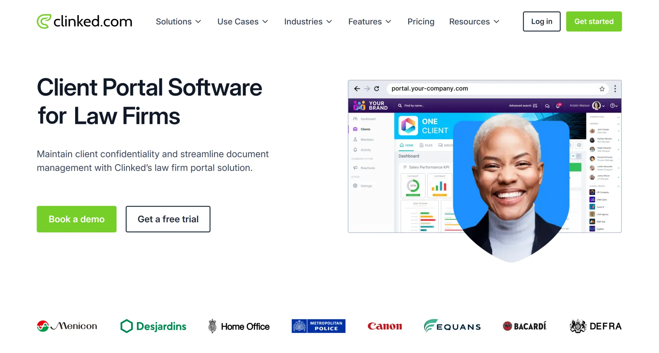
Branding the website
Client Portals need to accommodate a wide range of complex user goals and workflows across industries, and at the same time they need to appear intuitive and friendly. This branding concept addressess the visceral level of design, as visitors need to learn Clinked's brand in an instant. These visuals always appear in the hero sections of landing pages, and for all sections with a call to action.


Product visuals
The product visuals address the behavioural level of design — they suggest the product is flexible, pleasurable and easy to use. They appear in all website pages (~300 UI visuals).


Seals of trust
Whether they are standards Clinked is compliant with, integrations, awards or social proof, the role of these seals of trust is to address the reflective level of design — to consistently give users assurance the product is a reliable choice.


Improving prospect journey with good Information Architecture
Information Architecture components were designed to facilitate the prospect journey in alignment with the marketing strategy. Their role is to uncover the wealth of Clinked's features and integrations, eliminate doubt ("is Clinked really my best option for Client Portal?") and facilitate progress towards demo bookings.

Page templates
I used an atomic approach to content and CMS, building reusable components into four types of templates covering any future content requirements (global, use-case, special and features).

Learning points. Reflection
Working with UX-unaware teams can be improved by using user stories as briefs.
Switching to Webflow (and owning the backend for blog+website) allowed Marketing full control over content strategy.